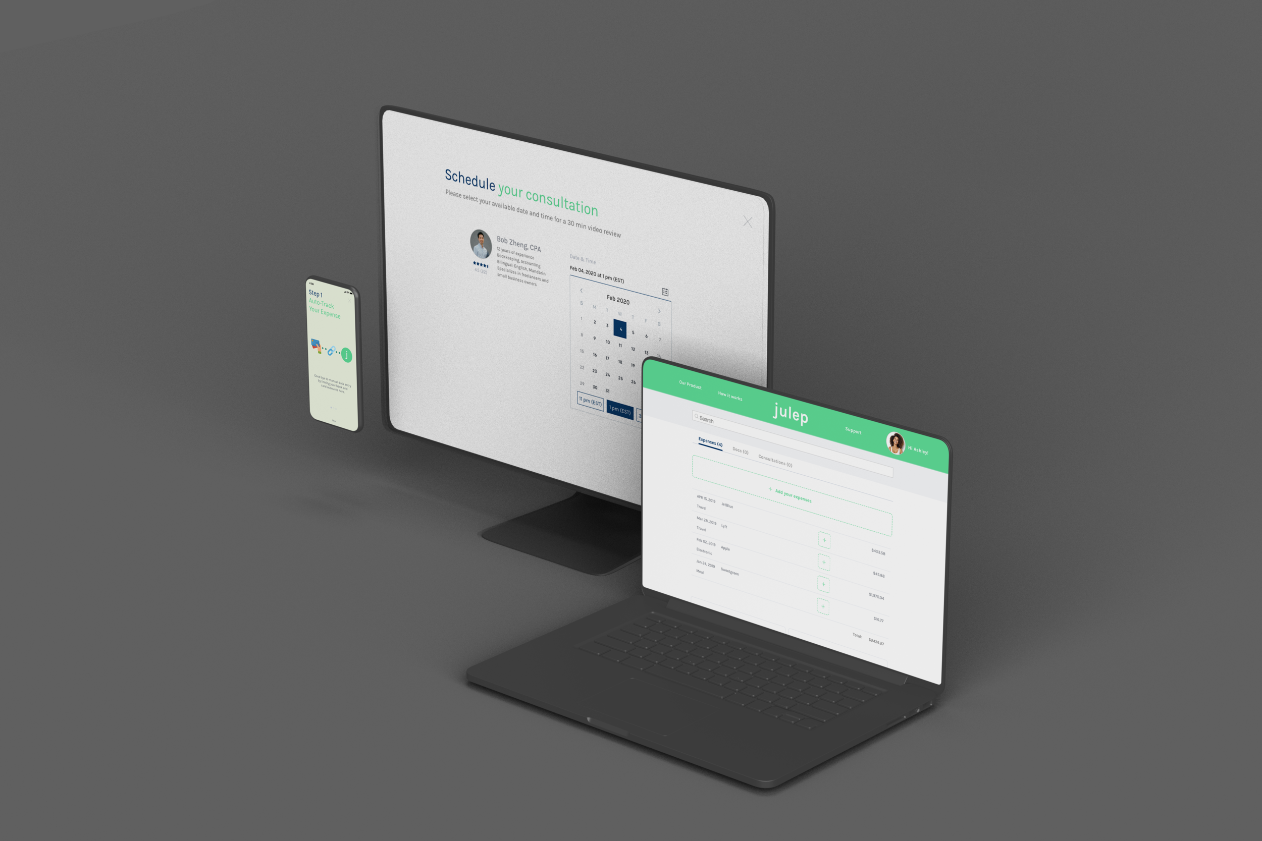
Paper receipts? Meet Julep.
I designed a responsive web application for freelancers to make filing taxes a little less painful - and to take better advantage of their surroundings.
Project TL;DR
Responsive web application
An all designer collaborative effort creating a financial solutions platform for independent contractors with multiple sources of income.
julep addresses common complaints about existing solutions which include functionality and intuitiveness. Our proposed prototype strives to make finances a stress free, seamless, and trustworthy experience for freelancers with multiple streams of income.
Quick Look
Digital Wireframing
Prototyping in Sketch
Competitive Analysis
c2c model
End to End Development
Lean Product Design
The User
Independent contractors, freelancers, and other 1099-classified workers in the U.S. must do their own bookkeeping which can lead to frustration during the tax filing process.
Team
Young Park, UX/UI Designer
Sam Hossain, UX Researcher
Role
I was part of a team of three designers and was responsible for the research and visual design the mobile web application.
I collaborated on the UI work, and produced an MVP of our platform with a design system.
As UX/UI Designer, I conducted user research and collaborated with my team members, working toward a lean MVP displayed with a working, high-fidelity prototype using InVision and Sketch.
Our team maintained daily stand-ups to align on product scope while designing and validating simultaneously.
During UX research and development, I considered intuitive user interface designs, micro-interactions, and accessibility while considering business needs.
Bridging the Gap
With the rise of remote working opportunities, independent contractors are becoming more and more commonplace - however, along with the flexible working hours and unlimited vacation days, they’re also responsible for their own bookkeeping at the end of the year.
Our team was tasked with building a responsive web platform with which our users can track their expenses and link their receipts to one account, as well as opt to speak to a real accountant.
The Approach
Reframing the Conversation
The assumption was simple—the rise of the tech industry and new found reality of work from home, the freelance industry has expanded in an unprecedented amount.
By looking to existing financial platforms and banking institutions - we naturally looked to leverage the existing infrastructure of competitors and comparators to build a more robust, appealing platform.
This early decision had a major impact on the quality of the customer experience we could both create and reconcile.
"I hate tax season. I always put it off until the very last minute because there's so much you have to do."
— Amanda, Freelance Graphic Designer
“There’s already so many different things I have to keep track of - taxes are the last thing on my mind.”
— Robert, Freelance Marketer

How Might We Design A Friendly, Trustworthy Platform That Allows Freelancers To Feel Better Prepared For Tax Season?
Mapping the User
Ashley, freelance art director
"I really enjoy my flexible schedule and independence but I need a better system to budget my expenses and hav more accoutanbility for tax season."
We developed Ashley, an amalgam as a result of the 10 user interviews conducted to align the team on our product vision.
We identified key pain points in the user journey map we created above. Our insights showed that our potential users will use the proposed financial platform to track expenses, account for income, and stay on track for tax season - and be connected to a real person if they need additional help.
Development
With insights gained from user interviews, the team prioritized key features that we needed to implement in our MVP - given our short two-week design sprint, we needed quick, innovative solutions.
Initial Matrix used to define what features to prioritize in the MVP.
Final Feature Prioritization Matrix
KPIs and Targets
90%
Satisfaction Rating
80%
Percentage of User Journey
3
Step Painless Process
The team set business and user objectives to keep these at the forefront of decision making. This ensured that our designs were validated by data as well as quantified goals.
Building the Wireframes
Created by hand and digitally through Sketch and InVision collaboratively.
Because people are already accustomed to completing quick tasks by phone and tedious work on desktops, I made the process to accessing our platform similar. First, users take a photo of their receipt, and forward it to the site. The photo of their receipt populates the text fields. Later, the user can access their account on desktop, and edit details as needed.
We also created a dashboard that was easy to digest at a glance, as well as a scheduling feature, with considered breakpoints, keeping in mind what our users prioritize when they’re on the go, or on their desktop.
Mobile App Development
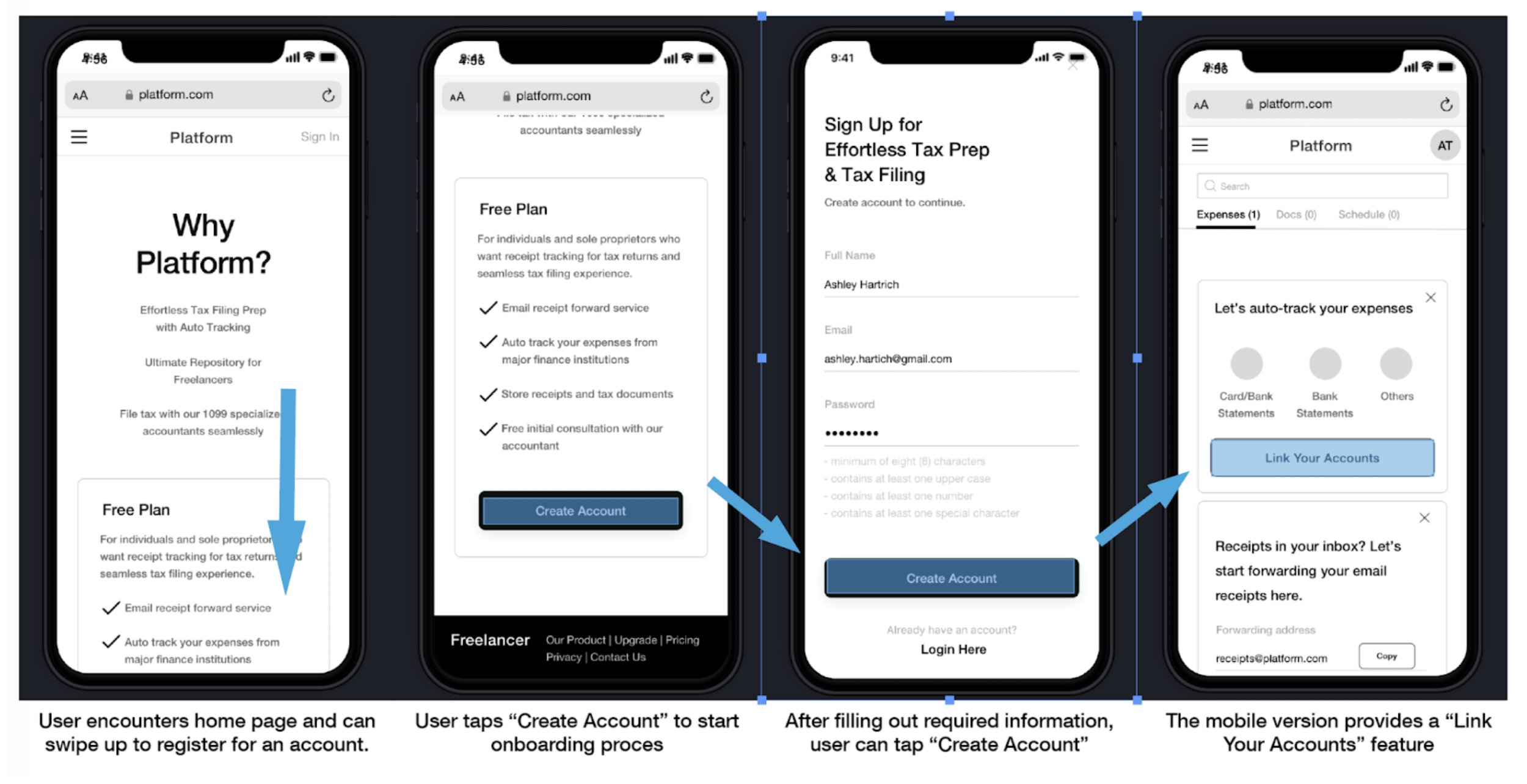
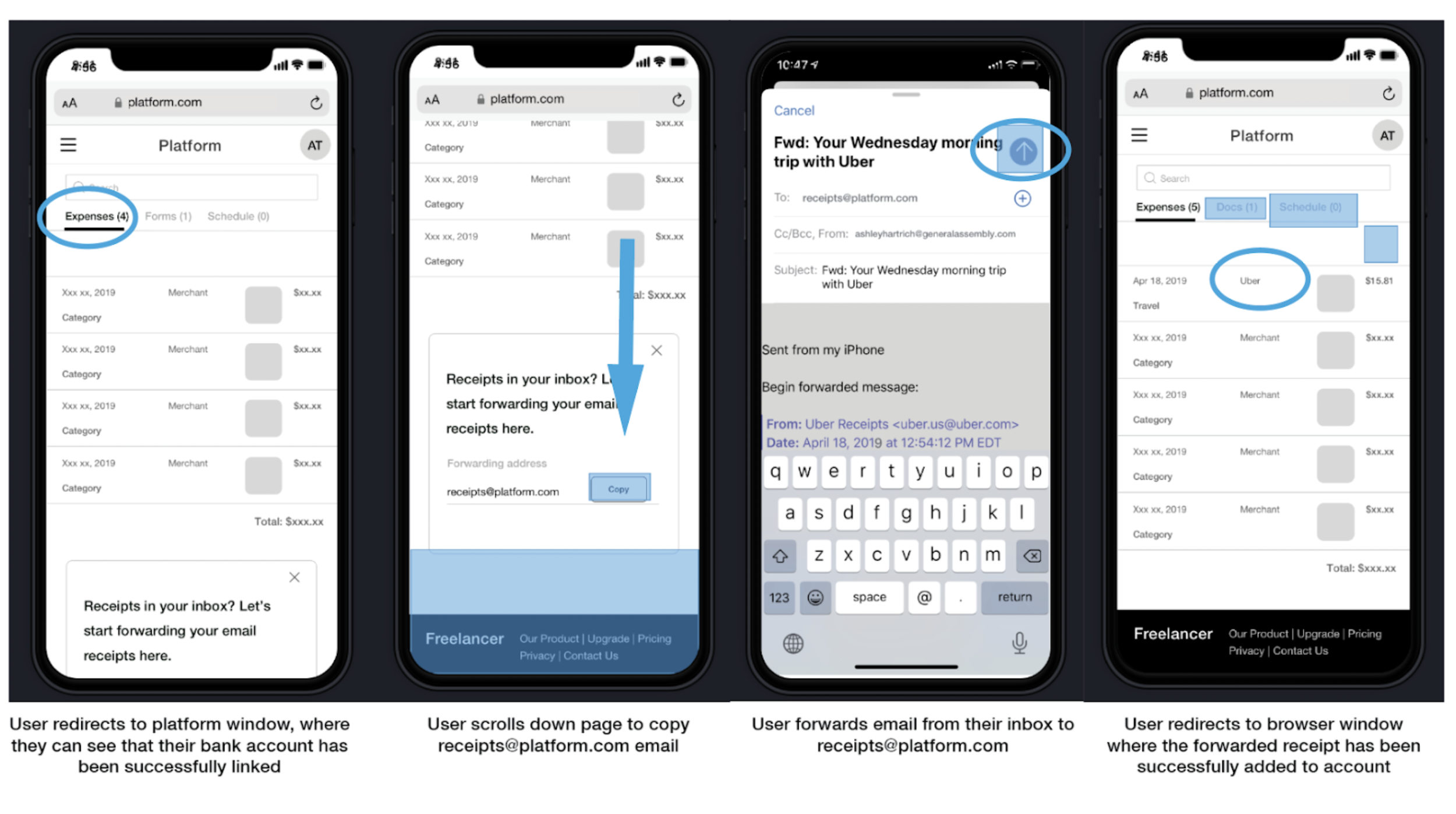
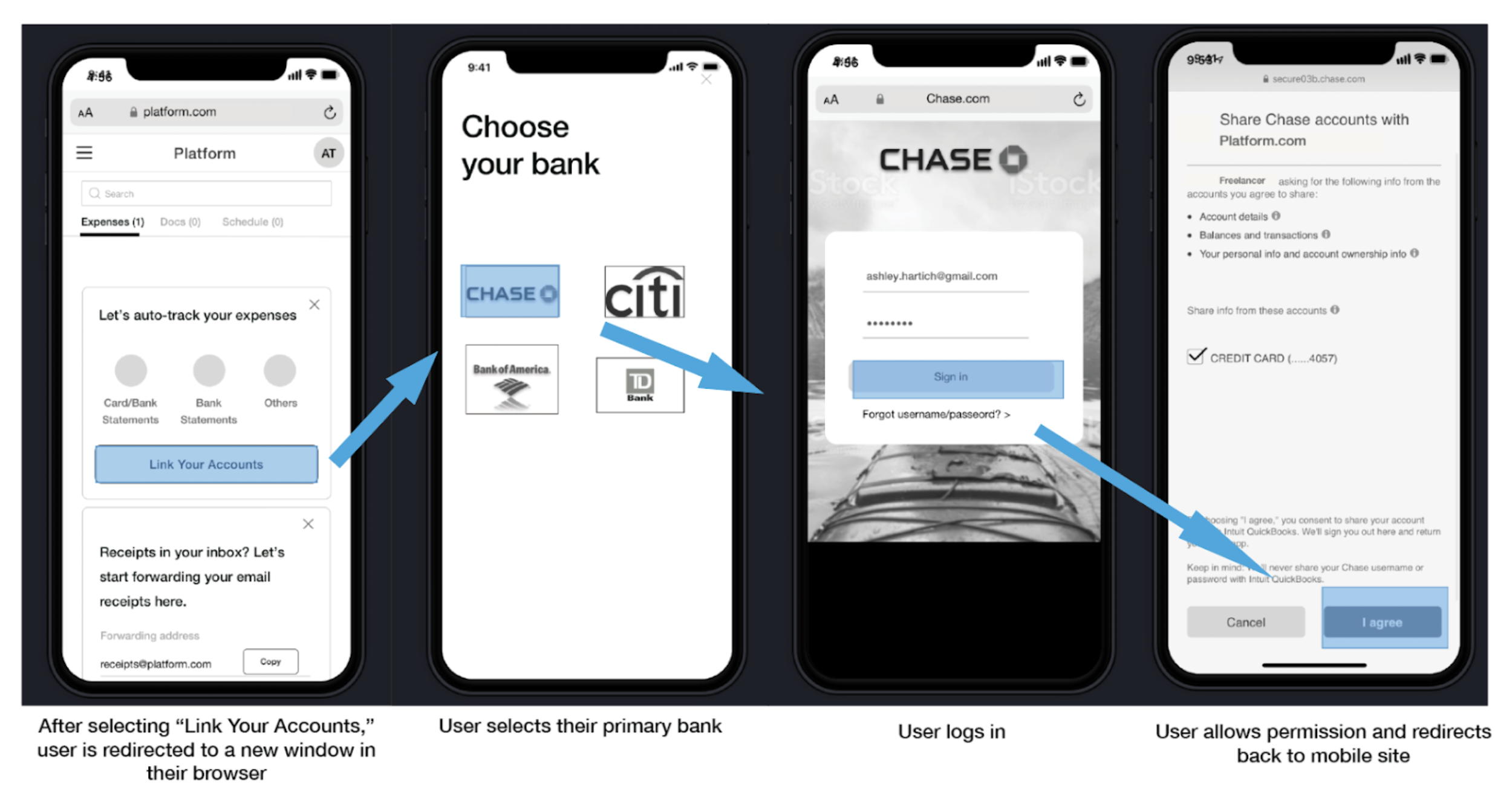
styling the screens
We put together a color scheme focusing on cool tone colors. This high contrast, vibrant palette in combination with the sans-serif typeface Karla achieves the look I was going for.
There are no sharp edges or hard outlines throughout the site elements; all buttons, thumbnails, etc. have rounded edges, illustrating the brand’s friendly, approachable point of view.
Responsive Web App Development
At the end of the two week sprint, our team created two high fidelity prototypes using Sketch and InVision, demonstrating how users can interact with the julep site as they would if it was deployed.
Onboarding
Users are taken through a fun, quick onboarding experience both on mobile and desktop.
Dashboard
At a glance, users can quickly keep a handle on what’s going in - and out of their accounts.
Expense Tracking
At a glance, users can quickly keep a handle on what they’re spending, and account for it.
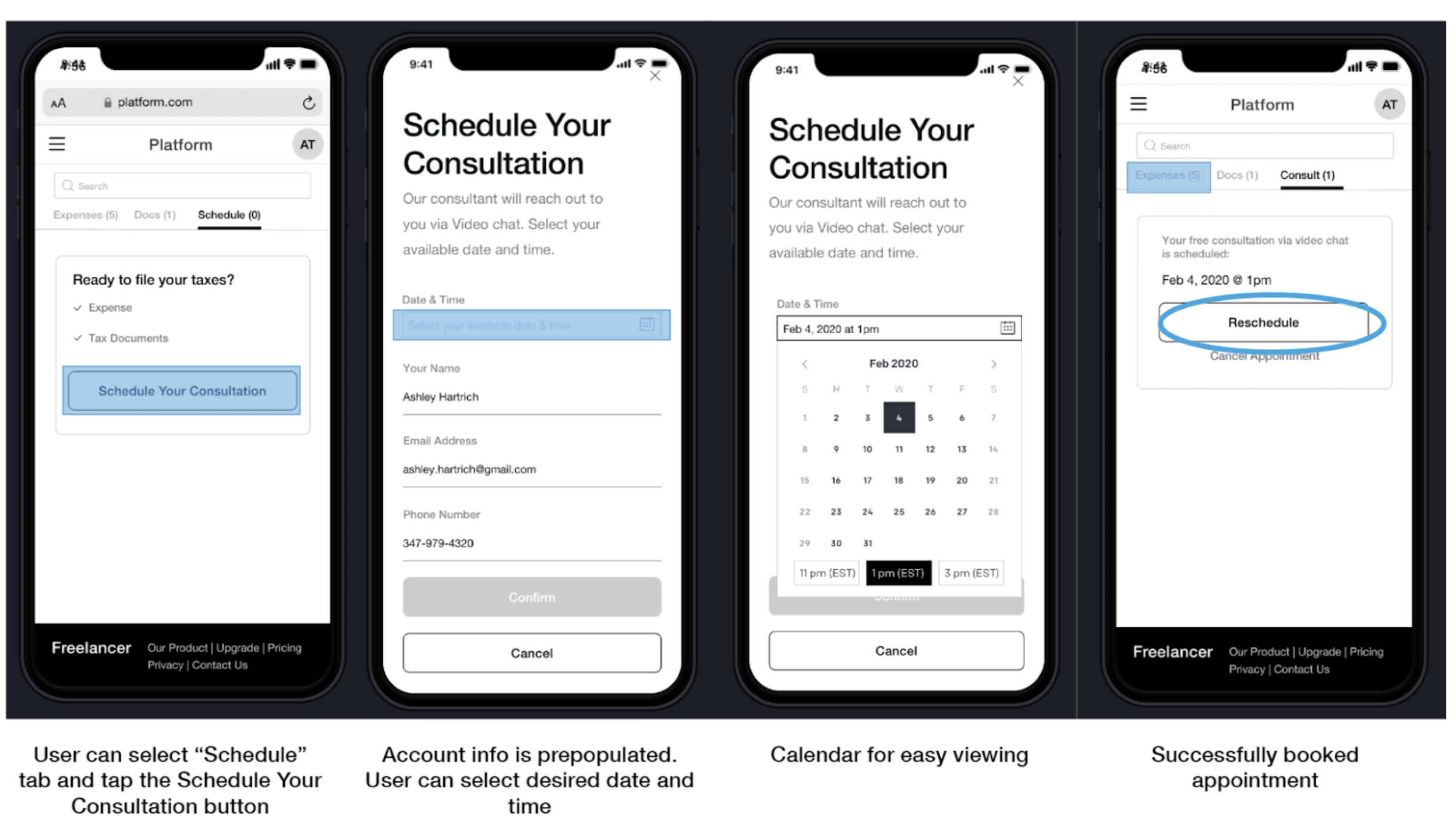
Scheduling
When users need a real professional for advice on filing/submitting, julep has an easy calendar and can select the time they need a consultation.

Takeaways
Working on julep strengthened my ability to create versatile designs.
Because I knew I would be creating both a web and mobile version of Julep, my design decisions were based on what is flexible, and adaptable. I also feel more comfortable preparing questions and gathering information during the user research stage of my design process. Converging data as a team using feature matrices and tables to organize the data collected clarified insights and drove design thinking forward.
Testing revealed that our users don’t care to budget, but they do care about organization - they want to see their personal information displayed in an easily digestible manner as well as security.
Our next steps map out areas for improvement.
Next Steps
⇢ Expand dashboard and onboarding
⇢ Improve primary navigation and utility
⇢ Improve UI and Graphics
⇢ Test for accessibility
⇢ Leverage accessible APIs (major financial institutions)
⇢ Conduct more user testing
⇢ Develop app
You made it! Thanks for checking this project out.


